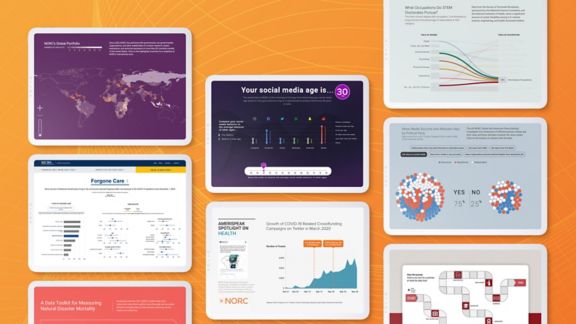
NORC at the University of Chicago has experts in data science, research methods, and statistics to help researchers effectively present data in a graphical or pictorial format. This ranges from producing complex interactive visualizations to simple charts and graphs. Our work has won awards from the Association of Public Data Users, the American Statistical Association, and the HOW International Design Awards.
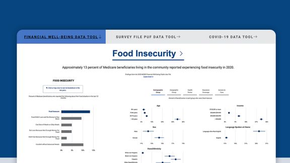
There are many types of data users. Some want only to find a number or data point, while others want to access all the data and do their own analysis. We consider all audience types and craft presentations for their specific needs. However data are shown, they should be presented fully and without bias. For example, our MCBS COVID-19 data tool employs hover-over sentences that include the question text, estimates, and standard errors to guide correct interpretation. We collaborate. We work with our communications team to ensure that the language in our presentations is understandable and turn to skilled designers to help create visually appealing tools that are still accessible to the visually impaired and branded for client recognition.
We have experience working with multiple visualization and programming tools for static and interactive data presentations, including Tableau, R and R Shiny, D3 (JavaScript), HTML/Cascading Style Sheets (CSS), PowerBI, and Adobe (InDesign and Illustrator).


